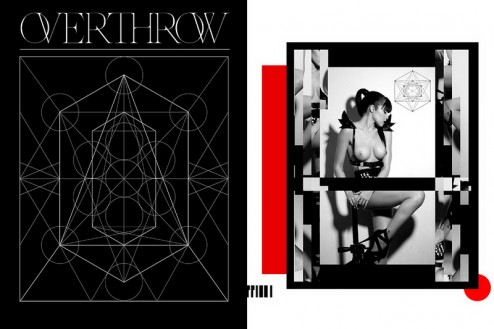
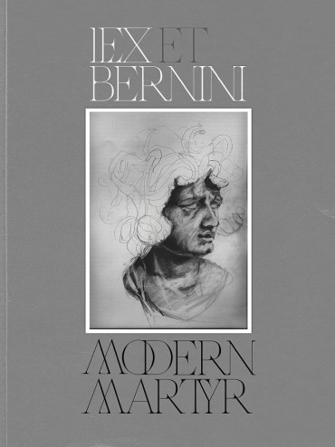
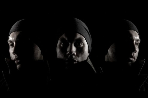
 Aerosyn-Lex Mestrovic deals in progressive visual design and sweeping calligraphic typography. By Matthew Newton — Born in Buenos Aires, designer Aerosyn-Lex Mestrovic has spent much of his time the last few years working in New York and Tokyo. As a senior partner in the Keystone Design Union (KDU), Mestrovic acts as the design society’s creative director, overseeing projects for clients such as LVMH, Nike, Coca-Cola, Diesel, and G-Star. Prior to that, he worked at lauded design firm Graphic Havoc. A graduate of Pratt Institute and Temple University in Japan, Mestrovic has exhibited his fine art in New York, Tokyo, and Paris. Last year he was selected by Dazed & Confused magazine as a Top Young Creative in 2010, and most recently exhibited at Deitch Projects’ spinoff gallery, The Hole.
What first attracted you to typography and design, and how has it kept your attention?
I came to design, and subsequently typography, from a fine arts background. I’ve always been a visual person. As a child, I was exposed to the arts by my parents who immigrated to this country from Buenos Aires, Argentina a few years after I was born. I grew up encouraged to pursue my penchant for drawing, and regularly went to private art classes where I studied calligraphy amongst other things. I grew up in South and Central Florida and got into writing graffiti, and upon entering college, I focused on fine arts. I apprenticed at my then professors’ artist studios and was able to apply my hand to classical figure drawing and portraiture in return for me sweeping, cleaning, stretching canvas, and generally earning my keep. It wasn’t until I moved to New York to attend Pratt Institute that I moved towards applied art and design. There I was fortunate enough to study with some world-class professors. One of them, Kevin Lyons, who is a famed designer/creative director in his own right, was my typography professor. It was really there that I began to take a more formalized approach to lettering and type design. I’d always been drawn to letter forms and the visual duality they embody. It really took a formal approach for me to appreciate the nuanced nature of typography, and the great visual depth that can be had by rendering the written word.
Design is an interesting field, because it’s as much an art as it is a skilled trade. What experience(s) stick out to you from your time at Pratt, learning from established typographers such as Kevin Lyons?
Well, design is as much as an art as it is a business. I think design is a visual language which serves a purpose and serves to communicate myriad things to an infinite audience. Everything around us is “designed.” Some of it is just more considered than others. Regarding my education at Pratt and abroad at Temple University in Japan, I can definitely say that the majority of the positive impact which came of those years was the relationships I built with a handful of professors. With that being said, just as important to me personally was the fact that while I was engaged in university, I was also finding my way through New York City ( Brooklyn to be exact ) and then also Tokyo. Those experiences and the people I met a long the way really informed me a lot. Working with and for Kevin [Lyons] at such a young age was a great honor. It was a funny situation, because I wasn’t the the model student; I’d skip quite a few classes and such. My only saving grace was that when I showed up for critiques, I brought good work. So much so that I was able to work with him outside of school. Having an accomplished and, to me, relevant person like Kevin teaching me about typography and pushing me to explore work beyond just it’s visual appeal definitely set me up for some bigger discoveries later on.
You’re currently creative director at the Keystone Design Union (KDU). Can you talk a little about what that role entails and how it influences your work on a day-to-day basis?
I’ve been a partner in and creative director of The KDU for the past five years. It’s definitely been an illuminating experience, both personally and professionally. It’s tested my mettle in more ways than one, and has really defined my working process. For those unaware, the KDU is the world’s largest private design society. We have over 1200 members, hailing from more than 80 countries. Members range from illustrators, designers, and artists to editors, publishers, entrepreneurs, and beyond. It’s a network that has organically and exponentially grown over the last seven years. Myself and KDU founder David Gensler have been working together for that time and began the consulting arm of the KDU. Via our agency, I’ve been able to work with clients ranging from LVMH, Nike, Coca-Cola, Diesel, G-Star, and Adidas just to name a few. We’ve also been able to focus our efforts on growing our own properties such as our in-house fashion label SERUM VERSUS VENOM (SVSV), or our previous magazine The Royal and our latest arts journal Solstice.
This network model we’ve pioneered has enabled a small core team based here in Brooklyn, New York to scale quickly and build vertical teams to service some of the world’s largest brands. It’s allowed me to sit at the center of a virtual talent army and work in concert with some very talented individuals all over the world. As creative director, I’m able to craft designs which set the tone for any given project and from there work with the team to realize my creative vision.
This working scenario forces one to stop thinking like a task-oriented designer, and apply real visual problem-solving skills to achieve the desired result.
When I think of the projects you’ve done, one that stands out to me is your calligraphy. What inspired you to pursue that as a design element?
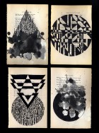
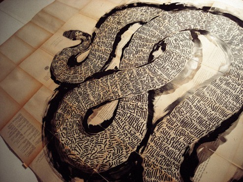
Thanks. I think in some way shape or form calligraphy has been a part of my life since I was paint-covered and sketchbook-toting kid. As I mentioned, I studied it formally at an early age, then it manifested itself when I began scrawling my name in the city streets with spray-paint and markers. It really became a part of my professional repertoire after I moved to Tokyo to attend Temple University Japan. While there I studied privately with some true masters of the craft. I’d always been drawn to the beauty of traditional Japanese calligraphy (Shodo, Gyosho, Kaisho) but was never able to truly verbalize what about it was so enthralling to me. Again, this brings me back to the visual duality of letterforms — the semiotics of the written word and the beautiful rhythms, shapes, and ideas they create. It’s much more of a design language to me rather than a design element. After some time I began to research and study various Arabic scripts and the Islamic traditions of calligraphy. I’ve tried to incorporate all these elements into my works and am infinitely inspired to continue this exploration into the world of the written word.
What do you think it is about text and letterforms that keeps designers so infatuated?
I think there’s a hardwired predilection in our brains that wants to process and ascribe value to word forms. I think there’s something innately humanistic about the rhythm of words scrawled across a page, or etched into stone like ancient cuneiform. For me there’s a true love affair with the written word. I get a real and at time oddly inexplicable comfort in seeing a page of well-laid type, or seeing a deftly scribed swash of calligraphy in black ink across a leaf of paper. Also, the ability to design something that has double meaning is truly inspiring — the idea that what one is designing not only communicates verbally, but also literally is definitely something that speaks to me as a designer.


“An oasis in the concrete jungle. This is my NYC escape. My private roof deck. I spend a lot of time out here.”
The world of art and design has not only become extremely congested in recent years, but also highly competitive. What’s your take on the ever-changing landscape?
I think our generation exists in a transitional period in history. This question speaks to concerns not only in the design industry but in creative industries in general. There is a saturation of creative tools in the marketplace and the means by which to create and propagate compelling designs, films, clothing, publications, furniture, photographs, etc. are but a few mouse clicks away. This has certainly “leveled the playing field” or rather, democratized the creative professional landscape. There are volumes of theory and prose devoted to this notion of the democratization of creativity. Authors like Chris Anderson, to theorists such as Baudrillard, McLuhan and Zizek have all identified and pontificated upon this very topic. I think what we’re seeing is a paradigm shift. The creative industries have always been more egalitarian in their structures than other industries simply due to the fact that “talent” has been, and is still a deciding force in one’s success. If you’re a shit designer, it rarely matters that you got your MFA from Yale for example. Your work is your work, and unless you’re leveraging your alumni network and activating whatever connections you may have, your work will still be judged alongside the likes of a 15-year-old Polish kid from Warsaw with a pirated copy of Photoshop on his PC who’s taught himself how to create world-class, campaign-quality work with nothing but sheer talent and spare time.
I’ve only been in this game for a few years, but I’ve learned to embrace this new ubiquity and use it as an accelerant to my own working process. There is so much good work out there that it’s dizzying — vertigo inducing. The only reaction can be to falter or to strive to create something genuinely new and different.
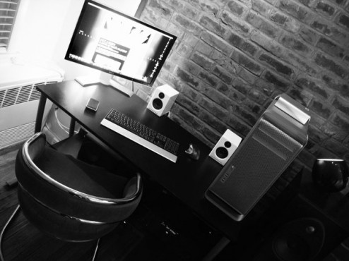
“A view of the desktop. I keep it minimal and uncluttered. If cleanliness is close to godliness, then I’m the G.O.D.”
Your reference to the “15-year-old Polish kid from Warsaw with a pirated copy of Photoshop” interests me. Do you think this new generation of designers is less concerned with pedigree (i.e., prestigious university degree, coveted internships, etc.) and more fixated on just getting to work?
Definitely. I think we’re going to see the rise of a new creative class. I’ve been speaking about this more and more recently and the ubiquity of creative tools, matched with the speed of the distribution and consumption of content will equate to more and more creatives populating the socio-economic landscape. You have major academic centers like Harvard and Rotman Business schools teaching “design thinking” and saying that business leaders of tomorrow need to be as much businessmen/women as they do designers. A more content savvy consumer means an increased demand for better designed products. I think we’re headed for some interesting times. I’m working on presenting these ideas to some major sports brands right now and they are definitely listening and intent on fostering and leveraging this new creative class. I’m excited by it for sure — I just can’t imagine what happens with the BRICS ( Brazil, Russia, India, China, South Africa ) nations step onto the world’s creative stage. We’re definitely in for a rush of new design thinking for realz!
In your roles as designer and creative director, what are the most challenging aspects of the work? And what is most rewarding?
What’s most rewarding: Creating work that is undeniably mine. By that I mean the ability to create an ownable visual language and identity. Crafting that takes time, effort, dedication, and a bit of dumb luck. That’s something that definitely pushes me. What’s most challenging is dealing with the oft tricky and perilous balance between commerce and creativity. The strains of commerce really demand a robust creative mind — one has to be able to do away with any precious objectivity about one’s work and understand that this is a matter of problem solving. The strains of just running a business are tough as well — though that’s true with anything. I’m sure running a Mickey D’s franchise is no picnic, though I’m kinda tempted by that ’cause I do love McFlurries!


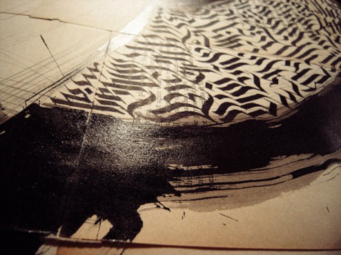
“Close up of new works in progress. Some pieces being worked on for Ogilvy + Mather Germany.”
http://cpluv.com/generic/mainitem/37542


