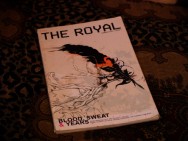
 The start of it all, I guess you could say…I have a biased perspective, only because I was appointed Senior Editor in 2006 & currently have a gang of online interviews still on the archived website (ie. MWM, Justin Maller, Valp, Fatoe, Kinkyform & Monaux) & other places. Well, in my opinion, as far as a production & what is seen on & offline – this is by far one of the best. Now when you consider independent motives, scale doesn’t really compare, but…this thing was put together by the same guy that put together strategy for Rocawear [Exhibit A or reference NATIVE DBG].
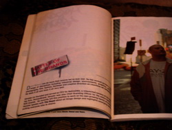
Exhibit A
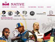
Native DBGSo generally speaking, you may not have suspected this was going to be anything other than what it was, but when I viewed the first images, I knew I was seeing something that would change my life…The first issue for me, is/was ‘Blood, Sweat & Years’ Summer 2004 / Issue 3. Why? Because, it profiled this guy I knew from the ‘design-community’ in a different way. His company used to be, Human Brand, using this strong fusia color [link] which was popular back then, somewhat, at least w/ myself. They also had a guy using pink named Karim Rashid, which I was just super inspired by. Pink is a mans color…men love pink, there is an esoteric thing to it which turns out to be something of the messiah? Anyway, amongst that, I was opening my eyes to this design community becoming a reality in MY life…it still hasn’t picked up in a lot of communities, you see a good amount of bad design in all fields of business so, this is really personal. Me being from Delaware, seeing something that emphasized DESIGN was big, on that note, I was viewing online – I didn’t get the print issues in my hand until the last book was released…a little bit after that. In the midst of the outcome & happenings of the wars between The Royal Magazine & whoever else [Gheen/Karmaloop??] had beef w/ the usage of the name & etc. I kept my love for the thing, so thats what we’ll explore. 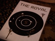

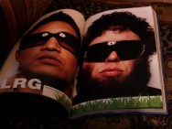
Exhibit B MY key word, MY next & probably most fav. issue is HANDLE YOUR BUSINESS Spring / Issue 5…think about it, Jonas [Exhibit B] is dead, RBK was profiled & that was a height for us, as a people I mean, Allen Iverson sneakers were the precedent for the Jay-Z/50-Cent collab etc., so companies like Arnell Group, Strategic Group, Spyker & Taschen…just phenomenal to see that this is our potential. Streetwear is looking to sell-out hence the Nike ID ad on the back, what else is a goal? I’m not a fan of any genre so-to-say, I’m just aware of a good amount of the nuances that make it a reality for others…

Exhibit C Lost in Space Fall / Issue 6 [Exhibit C] is aptly titled containing the start of sneaker worship, Blue Ribbon Sports – the start of Nike. Doesn’t mean much to me fortunately, other than, this is the god that they follow, good to know for strategy in war. This issue is filled with our Comic-Book idols as well, starting out the magazine’s ad’s w/ Five Pointz Clothing X Grandmaster Flash. I mean, I don’t know what else to say, this issue is about craft & in my opinion, there is a whole lot of what the mundane call ‘boring’ when it comes to creativity, but its not boring to those who are passionate, its the foundation of things and we utilize this daily. Math may seem boring but when you look at whats explored in CODING AESTHETICS you will see why numbers are GOD. Lastly, another deified entity, Peter Fahey, founder of SneakerPimps is examined a bit here…so we see why this is speaking of the origins of it all hence the SPACIAL aspects…whats in that darkness? 

Exhibit D This brings us to USURP via Issue 7 [Exhibit D] which by definition is to seize and hold (a position, office, power, etc.) by force or without legal right. The back cover is a quote from David Ogilvy for big The brand experience division of Ogilvy & Mather, “If it doesn’t sell, it ins’t creative.” This was the first step to this publication claiming its ‘royal’ status, you can see the treatments certain pages go through for SVSV’s editorial. The cover itself went through months of work, as the story goes & in my opinion the result of this put together is starting to give a different perspective of what a print is supposed to do. BOOM, DESIGN IN CONFLICT Issue 8, [Exhibit E] with all types of dope styles of design in this book. Not only that, the who’s who were all mashed in this, from Crooks n’ Castles to Burton to MIHARAYASUHIRO for Puma…all jam packed in what started out like the aesthetic journal that The Royal Magazine evolved into….
 Exhibit E Lastly, Looking Forward to Back in the Day Issue 9, [Exhibit F] which in my opinion, was the closing out of a thesis. Gathering what others thought of this thing that we are all coming upon. Designing it yourself, acquiring the network through global interaction. Its like Napster wasn’t really about the industry of music, it was about file sharing which is an attack on High & Low IP industries. The segue was an allusion to the illusion of hiphop culture. This is where each musician lives, vicariously though what hiphop represents. Herbie Hancock is celebrated in Vienna, thats hiphop. The spectacles acknowledged I actually did some work for ‘back in the day’ [link] so its not really a reality that these artists are actively living. Some of them are, most aren’t, the industry is a facade & rarely pick up on the real trend which most of the time its them, the artist is the trend, so are they following their tail?
 Exhibit F
 sonn
sonn
son on facebook
son on twitter
sonn on tumblr
son on computerlove
 aa
aa
aa on vimeo
aa on facebook
aa on twitter


